Shake Shack Kiosk
2017 was an exciting year for Shake Shack. In September they launched their first self-ordering kiosk store in Astor Place, New York City.
my role:
I served as product designer, building off my experience with designing their order-ahead apps. With familiarity of the brand and a range of knowledge of ordering products under my belt, I worked with a small agile team to consider the entire ordering experience both on screen and in store.
the challenge:
It's simple: keep it simple. Create an intuitive interface and savvy user journey that so many kiosks today seem to overcomplicate, and ensuring to marry it with a visual system of two successful apps. Oh yeah, and reduce order time, beat the conventional cashier checkout duration in the process.
audits & research
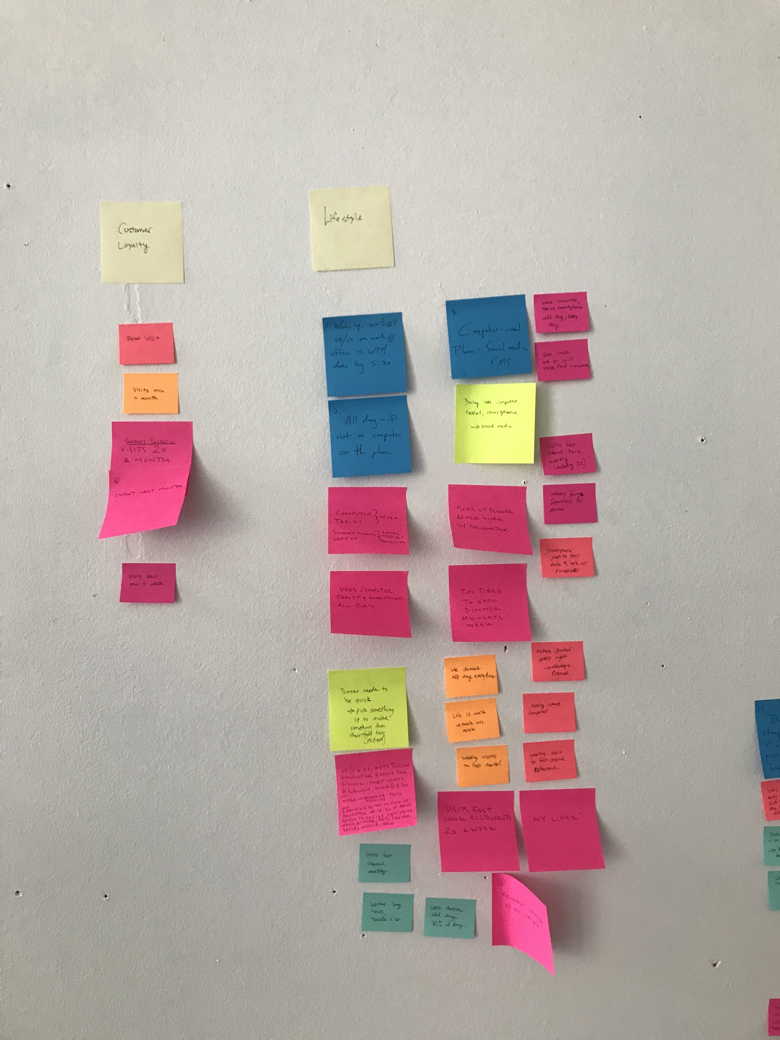
Our team assembled user personas to discover the Shack customer better. Ordering from your own device is easy, but learning what types of users would be using the kiosk in store was key to the evolution of the product.
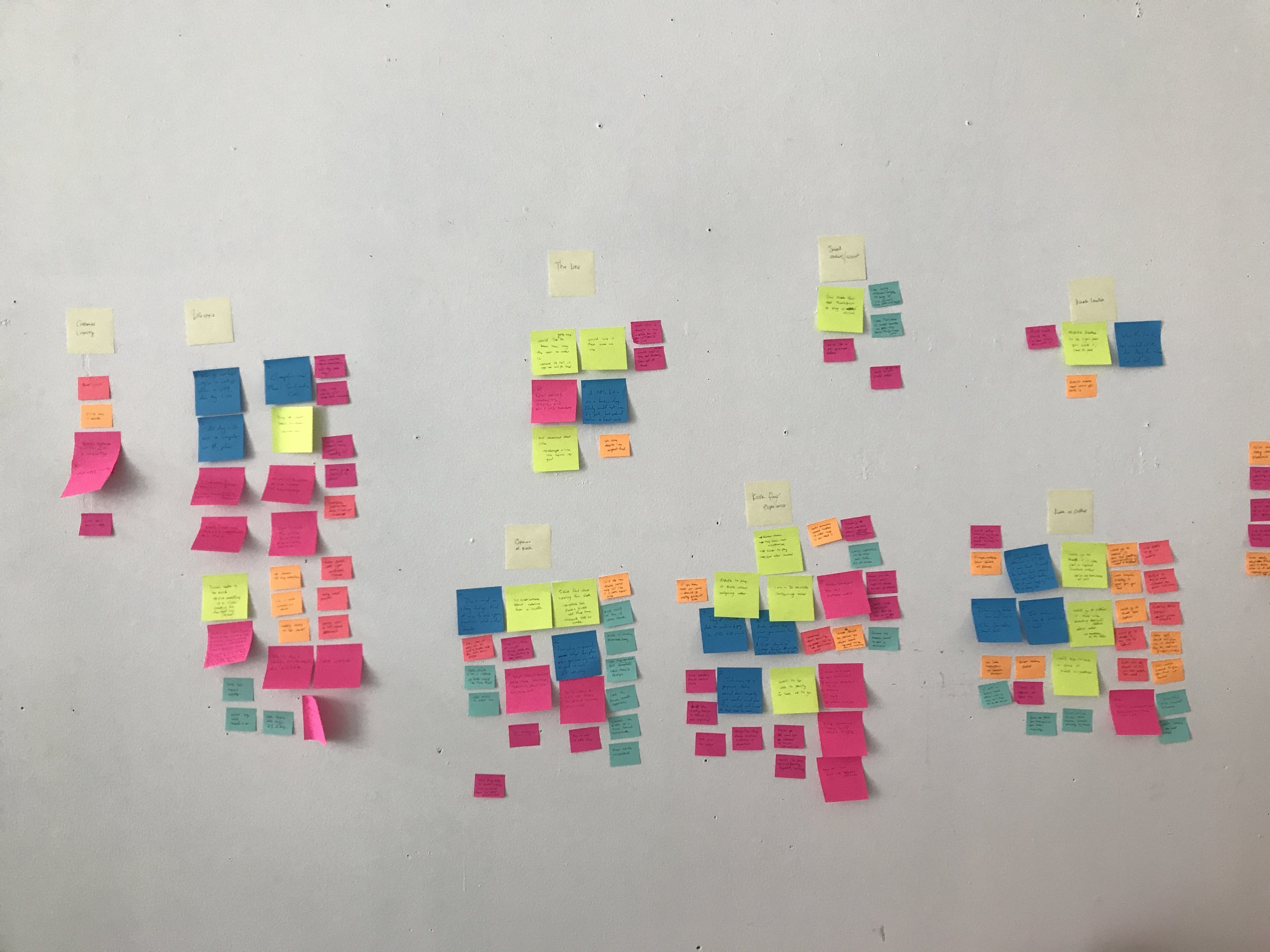
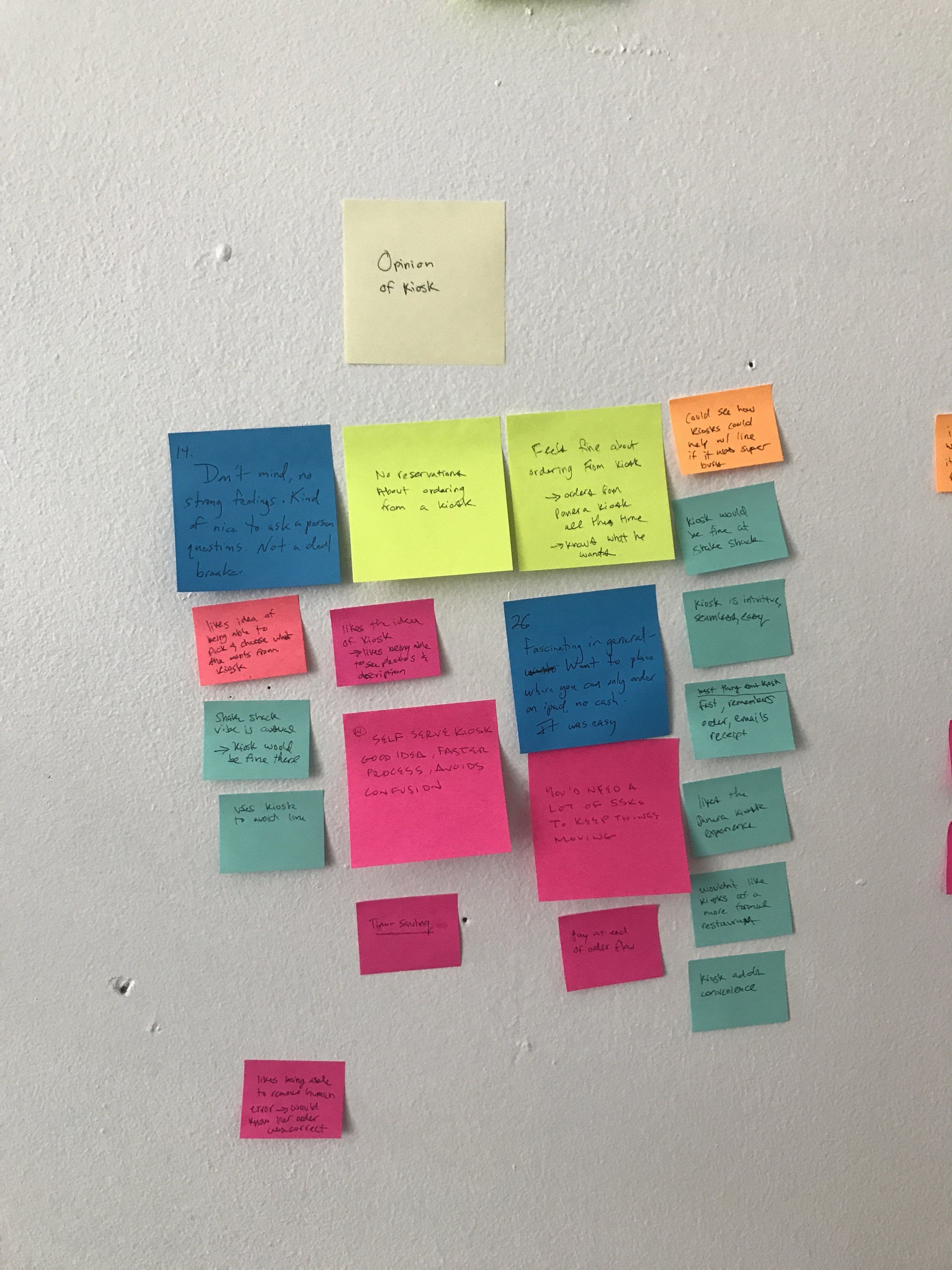
Conducting interviews, we mapped and clustered our findings based on key components that were unique to both kiosks and the Shake Shack experience. We wanted to know more about what people expected from a kiosk-ordering system, and what they did and did not like when it comes to ordering their food.
In addition to understanding our users better, another crucial element was to learn more about the competition. Conducting a series of audits and research; from broader categories like bank ATMS and digital ticket booths, to closer brand competitors like Panera Bread and McDonalds; we learned what worked, what didn't how we can better improve the overall experience. From screen sizes to physical line flows, every aspect of the experience was considered and studied.
sketching
A few weeks of sketching, iterating and experimenting naturally led me to specific considerations. A refined user flow and clean visual language was needed to meet the needs of those with all levels of digital comfort. Larger, tappable touch points and a minimal amount of screen advances cleverly drives the user forward in their order process.
beyond the screen
Taking things a step further, I considered environmental design. After researching competitor's kiosk experiences, I wanted to see how we could celebrate the Shake Shack brand beyond the screen. Every Shake Shack is customized to live cohesively within its neighborhood environment. Creating mood boards and sketches, I looked at elements like wait-line flows, physical kiosk casings, and the implementation of digital wall boards. As one of the most special Shake Shack location to date, I wanted to make sure it's personality shined.
product photography
Updating the photography was a must. A consistent, mouthwatering view and quantity was key for the kiosk’s success. I was able to spend a week on location assisting in the food photography’s new art direction.
4, 6, or 12?
Continuing to explore in rapid ui wireframing, I explored how main navigation could work for the user, or against them. In wanting to keep a familiarity with the existing order ahead applications, lockups like the one above began to shift too far away from the visual system we had set in place.
Learning from the app's challenges, like how presenting various customization options affect kitchen production, I was weary of exposing features like these. Not only do the multitude of options distract from the main goal, "Add", they suggest that this item should be customized. It's a fine line uncovering what a user could do vs. what they should do.
When laying out the grids for the menu, I wanted to minimize as much "scrolling" as I could. The natural inclination to squeeze as many items on a screen as possible proved too hectic and overwhelming. Not to mention a single category could hold anywhere from 3 - 12 items at a time.
Finding the magic number, 4, resulted by close inspection on menu structure. Playing card styles and type legibility, I constantly strived to find ways to remove shapes and inherent lines to further minimize the visual load. Still, this style of combining solid cards and imagery proved to be too much.
coming to life
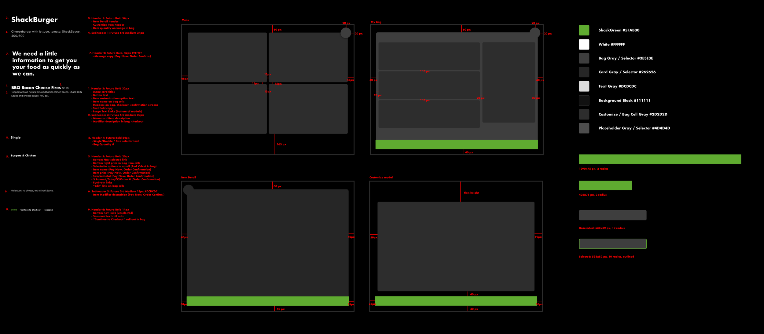
Large scale, mouthwatering imagery contained in big, tappable cards fill menu the screen, providing ease of use and showcasing how delicious Shake Shack's menu truly is.
Tapping on a menu card brings a user right into the item detail view, where he/she can quickly add their selection, choose between high level sizing options, or easily customize their item.
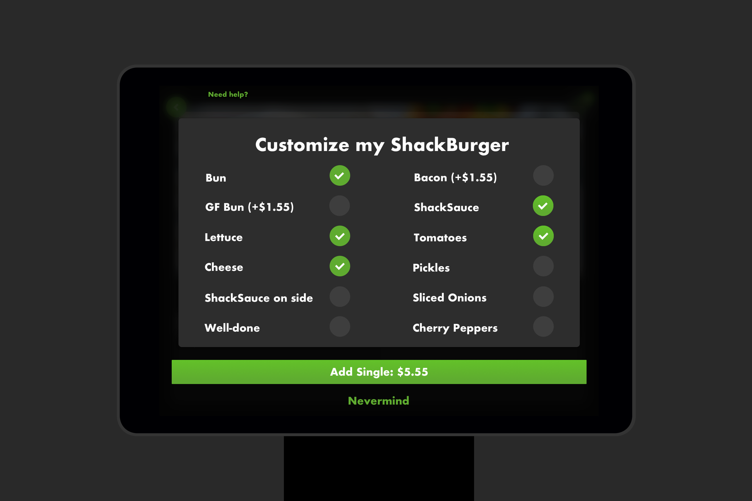
Tapping the customize button seamlessly opens a full screen modal view, where one can choose from a variety of pre-populated customizable options. No cheese? No problem. Just tap the check. Want to add bacon? You'll know exactly the extra charge by a real-time price update in the Add Item button.
The sliders stretch
The buttons bloat
An innate bag design puts users mind at ease, calling on all the tried-and-true elements that work so well across multiple ordering products. However, important nuances like the use of cards, allergy selectors and an enticing up-sell opportunity gave us enough to round out the perfect ordering experience.
Just because this product had to be robust in its efforts doesn't mean it can't be simple. A highly refined user flow and visual language broke the kiosk down to four core screens, with varying shades of black and grey to create a layered, highly considered visual ordering experience.
admin support
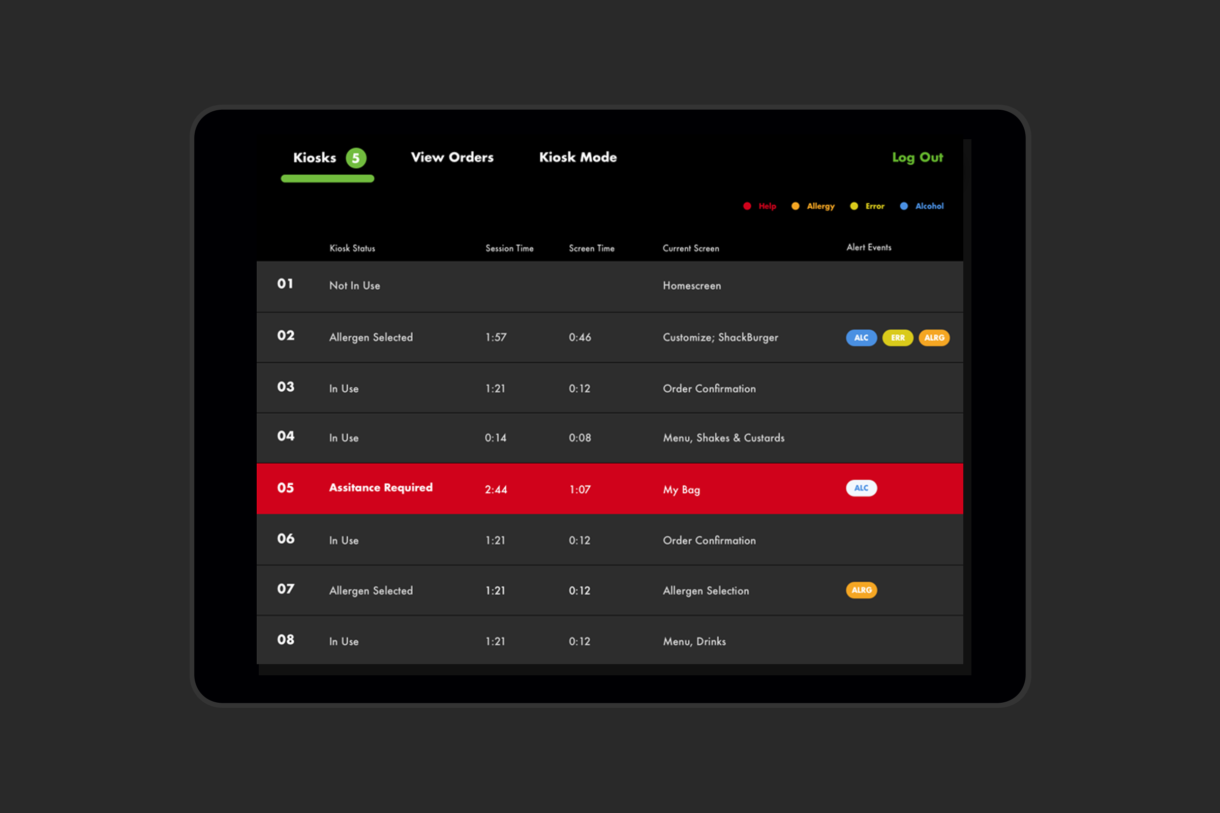
The backend admin support was one of the final stages of the project. From bug reporting to ID’ing for alcohol purchases, the hospitality champs at Shake Shack deserve just as intuitive an experience as the customer. Linking with third parties, such as Square, Olo, and NCR all brought important considerations for the success of the kiosk experience.


